Re: Time to vote on Nelson welcome sign designs
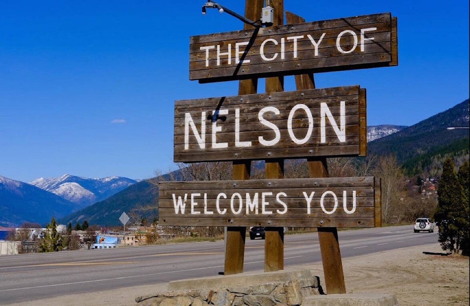
The final four designs appear on the Nelson website to be voted on and it looks like there was a very evident bias on the part of the selection committee. All four options for the final four has a strong resemblance to the existing sign. All four submissions use the same wording and similar type face. Less bias and a little variety would have been refreshing.
The Option A applicant states that he or she is a designer, but shows a complete lack of design or typographic skills using three sizes of type and the huge space between “WELCOMES” and “YOU” reduces legibility. The three panels are awkwardly positioned and the historical references in the design are obscure.
Option B is the best of the lot with a simple layout and well-spaced letters and words. This one also will probably last the longest with the treated wood and aluminum letters.
Option C’s bio also states that he is a graphic designer and does show some skill with shapes and typography. However, I would argue with his suggestions for materials and method of execution. His revision of the wording on the backside of the sign is a big improvement.
The Architectural Technologist who produced the monumental Option D should leave graphic design to those so trained. The word “NELSON” crowds the panel it’s on to reduce legibility, the light looks like a giant shower head and its position would do a poor job of illuminating both sides of the sign. The method of construction would make this option the most expensive to produce.
My parting suggestion would be, to show visitors that the city cares about itself and its welcome, to include some landscaping around the three signs.
Barry Rice
North Shore